“Dark patterns” are deceptive user interfaces that trick people into acting against their best interests.
The General Data Protection Regulation (GDPR) provides a “gold standard” of consent—it must be informed, specific, unambiguous, and freely given via a clear, affirmative action. This strong consent definition also appears in many US state privacy laws, and new data protection regulations worldwide.
Regulators from the European Data Protection Board (EDPB) to the US Federal Trade Commission (FTC) have issued guidance and warnings about how using manipulative design patterns can violate data protection, privacy and consumer protection law.
Here are ten examples of dark patterns, with illustrated examples to help you understand how to avoid them. Official Guidance on Dark Patterns
Our dark patterns guidance is based on several authoritative sources:
- EDPB: Guidelines 05/2020 on consent under Regulation 2016/679
- EDPB: Report of the work undertaken by the Cookie Banner Taskforce
- EDPB: Guidelines 3/2022 on Dark patterns in social media platform interfaces
- UK Information Commissioner’s Office: Consent Guidance
- German Federal Government: Good Practice Initiative for Cookie Banner Consent Management
- FTC: Bringing Dark Patterns to Light
- The text of the GDPR
For more information about GDPR consent, see What Is Consent Under the GDPR?
Dark patterns are common in websites and apps. In this guidance, we’re focusing on cookie banners. However, the same principles apply to consent requests in many different situations.
Throughout the article, we’ve provided illustrations of “good” and “bad” cookie banners. These are just examples—even the “good” versions won’t be compliant in all circumstances. For example, you’ll usually need to provide more information about cookies, plus a link to your privacy notice.
1. Assumed Consent
Consent should be given via a “clear affirmative action”. According to the EDPB, actions like scrolling up and down a webpage or navigating a website do not count.
This means you should never assume you have a person’s consent. Cookie banners like the example below do not constitute a valid consent request.
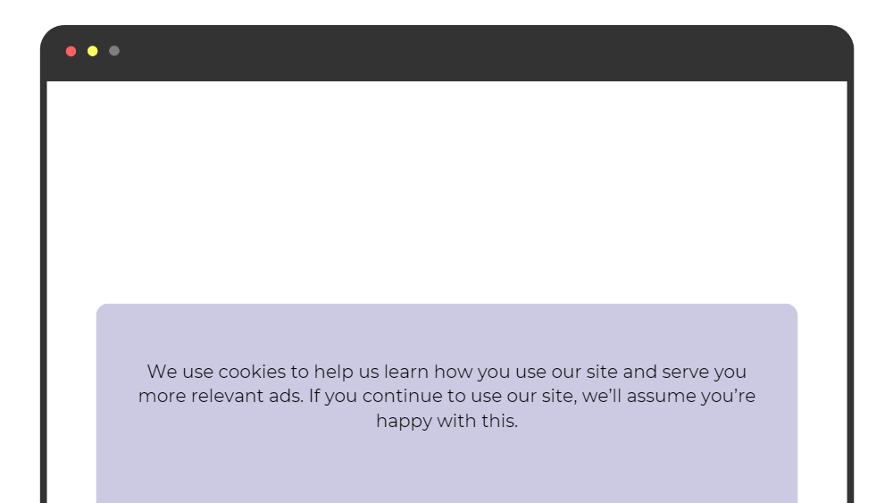
Note that if you use “essential” cookies that don’t require consent, you can use a cookie banner without buttons—but a banner like serves only to inform your users that you use “essential” or “strictly necessary” cookies, not to get consent.
2. Pre-Ticked Boxes
As noted, consent should be given via a “clear affirmative action”. This rules out “pre-ticked” boxes, such as the one in this example:
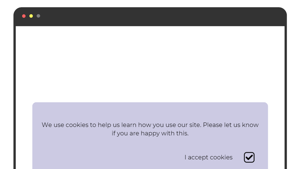
Pre-ticked boxes do not provide an unambiguous indication of the user’s consent. The user might have consciously decided to leave the box ticked—or perhaps they simply didn’t notice the box.
It’s OK to use tick boxes — but let the user take action, and don’t set cookies unless they do so. Leave the box unticked, like this:
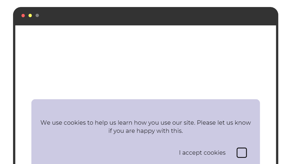
If you use more than one type of cookie, you can also use multiple tickboxes, like this:
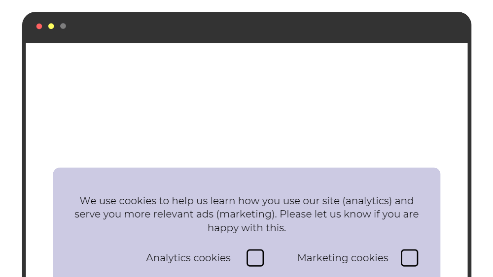
3. Unclear Language
For consent to be “unambiguous”, the request must be clear. This also relates to the GDPR’s “transparency” principle and the general requirement to use clear and plain language.
Some consent requests use unclear language that might be intended to trick users into giving a particular response. Here’s an example:
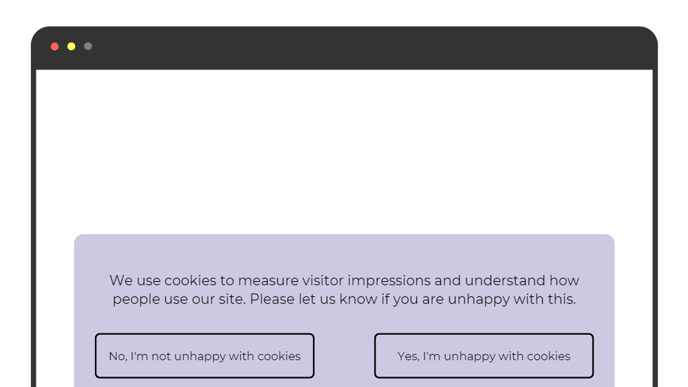
To ensure your consent requests are unambiguous, it’s best to avoid double negatives and to stick with simple choices like “Accept” or “Reject”.
4. Legalese
Another all-too-common way to confuse users is to use “legalese”: dense legal or technical language that the average person will not easily understand.
Here’s an example:
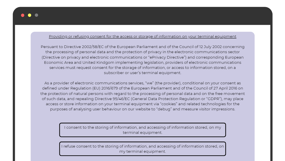
This wall of text is legally coherent, but only data protection and privacy specialists are likely to be able to understand it.
The GDPR and ePrivacy Directives are laws, but you should avoid legal language when requesting consent.
5. No ‘Reject’ Button
Consent should be “freely-given”. People shouldn’t consent simply because it’s the easiest option.
Let’s consider a common way in which many website operators make it easier to accept than refuse consent.
Sometimes the “Accept” option appears on the first “layer” of a cookie banner, while the “Refuse” option is hidden behind a “Manage Preferences” or “Settings” menu.
Here’s how this might look:
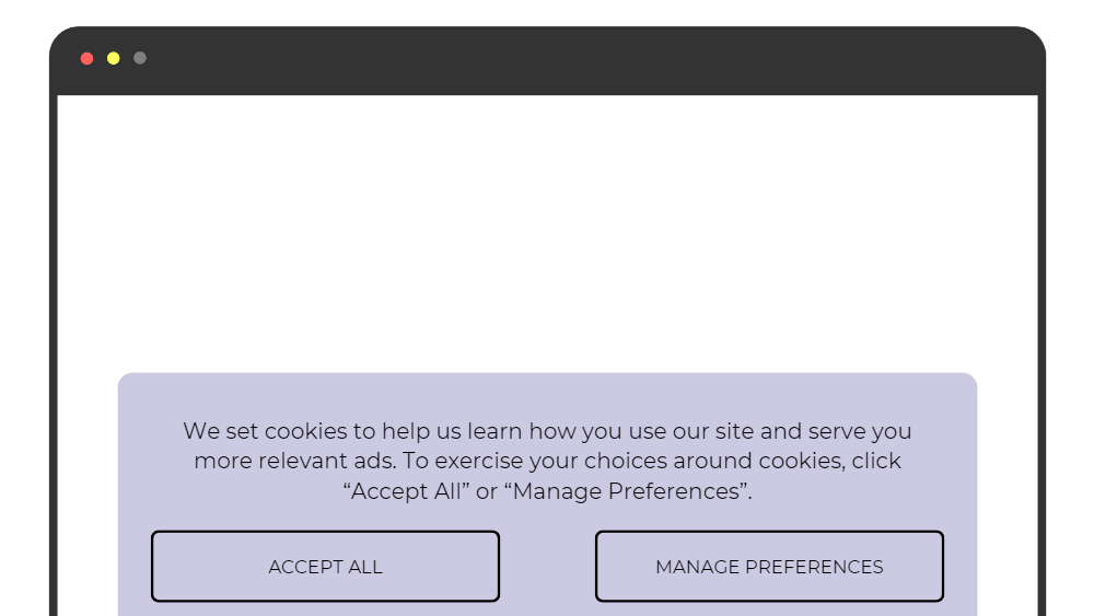
With this type of cookie banner, accepting cookies requires only one click, while refusing cookies requires at least two.
To make it as easy to give consent as to refuse consent, you can offer people this choice on the first “layer” of your cookie banner. You can still provide a “Manage Preferences” or “Settings” button to give people more detailed choices.
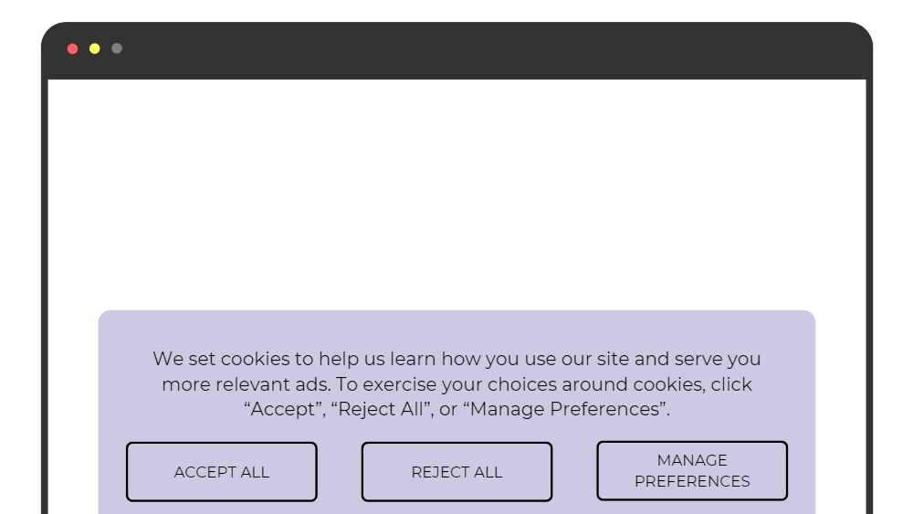
Note: This suggestion comes from EDPB guidance, but there wasn’t a unanimous agreement among the regulators. Some data protection authorities believe that the “Reject” button can appear on the second layer of the banner, behind the “Manage Preferences” button.
6. Deceptive Link Design
The EDPB’s “Cookie Banner Taskforce” found that some websites offer a “Reject” button on the first layer of their cookie banner—but rather than implementing the user’s consent choice, the “Reject” button leads to a settings menu.
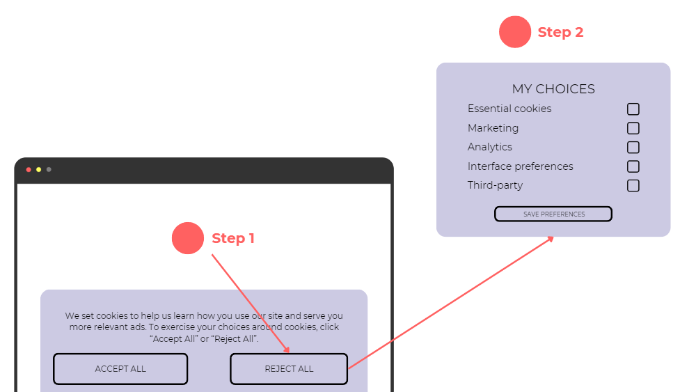
This is a clear example of deceptive design and arguably violates the GDPR’s “fairness” principle. Buttons should do what people reasonably expect.
7. Emotional Steering
Another way to ensure you’re providing a free choice is to avoid emotional or persuasive language.
It’s OK to use your brand’s voice when providing privacy and cookie notices. But try to keep your language as objective as possible.
Here’s an example of a cookie banner that clearly “steers” the user towards accepting cookies:
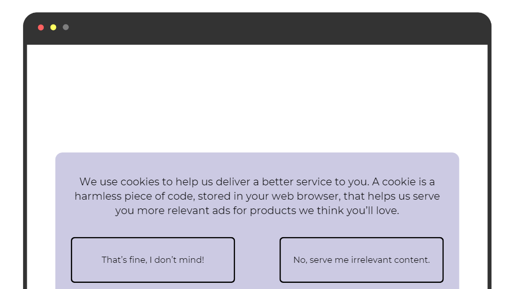
Some companies also use this emotional language to try to persuade people not to withdraw their consent or unsubscribe from marketing communications.
If someone wants to withdraw their consent, you must allow them to do so. Here’s an example of a company trying to “guilt-trip” its users:
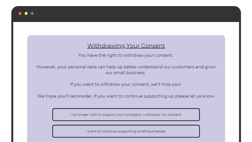
Under the GDPR, people have the absolute right to withdraw their consent. This means you should avoid trying to persuade your users not to exercise this right.
8. Cookie Walls
A “cookie wall” denies the user access to a website or service unless they consent to cookies.
In its 2020 consent guidelines, the EDPB states that “access to services and functionalities must not be made conditional on the consent of a user… (so-called cookie walls)”.
Here’s an example of how a cookie wall might look:
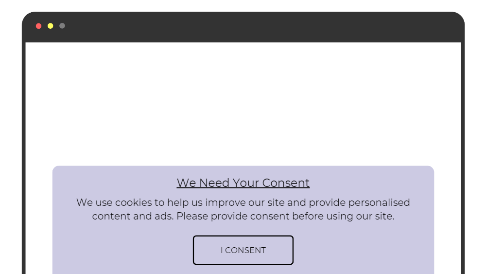
Faced with a cookie wall, the user has no choice but to consent if they want to access the website. But this “consent” is not freely-given. Try to make your cookie banner as unobtrusive as possible.
9. Deceptive Button Colours
Another, more subtle way to influence users’ choices is by using different coloured buttons designed to steer users towards a particular option.
Here’s an example:
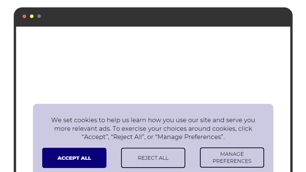
The “Accept All” button is bright blue, whereas the other options blend in with the banner’s background.
If you want to ensure your users are providing freely-given consent, you should avoid using different colours for different choices.
10. Deceptive Button Contrast
This final “dark pattern” is closely linked to the previous example.
Some websites try to de-emphasise certain buttons by using a font that doesn’t contrast with the background. Here’s how this might look:
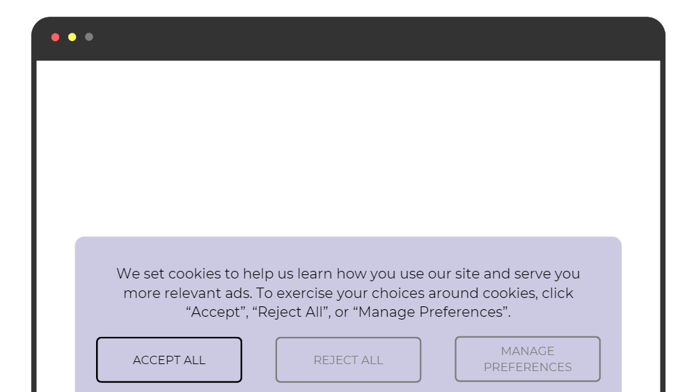
All the button colours are the same, but “Accept All” option is much more prominent. This is another deceptive design pattern that you should avoid if you’re seeking GDPR-standard consent.
Avoiding Dark Patterns Reduces Risk and Helps Build Trust
We’ve looked at ten dark pattern examples, but there are many more.
Whenever requesting consent, put yourself in the user’s shoes—are they making a free, unambiguous, informed choice?
Regulators are increasing enforcement against companies that use dark patterns.
But beyond the enforcement risk, using honest and non-manipulative consent requests can help you build trust with your customers and ensure you understand people’s true preferences.
